
These are a couple drawings that I took away from tonight’s session at the Visual Arts Center of Richmond. Both drawings are charcoal on 18″ x 24″ white drawing paper.


All Images © 2013 L.J. Hancock
These are a couple drawings that I took away from tonight’s session at the Visual Arts Center of Richmond. Both drawings are charcoal on 18″ x 24″ white drawing paper.
All Images © 2013 L.J. Hancock
We were late getting up this morning but it was such a gorgeous day today that we had to go and check out the forest at the Shenandoah National Park, VA. We spent a little time on the Appalachian Trail before we had to head back. The air was crisp and cool and the leaves of the forest were absolutely breathtaking.
This slideshow requires JavaScript.
All Images © 2013 L.J. Hancock
This art environment is a mosaicked gallery space and community arts center. Isaiah Zagar is the artist who created the Magic Gardens. Zagar has devoted himself to beautifying the South street neighborhood in Philly since the 1960’s. He started working on the Magic Gardens in 1994 and it took him about 14 years to create the project. The imagery refers to his family as well as events throughout history such as the 9/11 tragedy. The center is fully tiled from head to toe and filled with not only mosaicked tiles, but found objects such as bottles, bicycle wheels and sculptures. We had fun exploring the garden and I wanted to share some images taken from this beautiful place.
This slideshow requires JavaScript.
All Images © 2013 L.J. Hancock
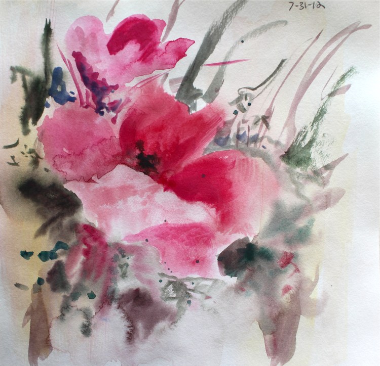
Playing around with watercolor washes and layers.
All Images © 2013 L.J. Hancock
Happy Saturday! Last night I went to a much needed life drawing session at the Visual Arts Center. We had a model who seems to be a regular around the Richmond life drawing groups. I really enjoy this model because he is quirky (cracking jokes most of the time) as well as comfortable posing. His poses are always dynamic and interesting. I thought that I would share a couple of nice drawings that came out of last nights group.


Given the current heat wave, I thought that I would share a photo that one of my students shot in the spring of 2011. The class met for a group critique only to be cancelled after 20 minutes. This is a photo of me walking to my car. Drink plenty of water and think “cool thoughts.”
Here is my finished portrait for the People’s Portrait Project at the Visual Arts Center of Richmond. The submission date is May 25, 2012 and you can submit as many as you want! Get to work! http://visarts.org/special-events-2

He would only sit for 5 minutes total so most of the drawing came from a photographic reference. If you have the opportunity to do so, working from life is much easier than working from a photograph. I am comfortable using photographic references but life drawing is my preference.

I had the pleasure of working with some dedicated students (at three different schools) this semester and I thought that I would share some of the projects that they completed.


For the project below, the students were asked to depict an interior space that they see on a daily basis, using linear perspective. The students were also asked to include thematic elements that told a narrative of how the space functioned for them.


For the final project, Drawing 1 students were asked to create a self portrait using the grid method. After transferring their image, the students were to include additional elements in the background/negative space to enhance the drawing.


The Drawing 2 students were given a project inspired by artists, Christo and Jeanne-Claude. They were asked to choose an interesting object and wrap it in some type of material for working in class. After the students created the graphite drawing, they revealed the object underneath, to the class.


The image below is a drawing from the “Trois Crayon” project. The trois crayon method was a method used by artists of the Renaissance, in which they would draw with red, black and white calk on toned paper.

The Drawing 2 final project was to choose a “master work” by a master artist and re-make the work in soft pastel, adding contemporary elements. See if you can note the master works chosen and the changes added. 😉


I also taught an Art Education, 2D Experiences class this semester. The image below, is the Cultural Heritage project. I asked students to research their cultural heritage by interviewing family members. The students then had to choose an important figure (grandparent, parent etc) and include text, symbols, colors and/or images in their work of art, that told a story about that person.
The first step was to create an ink wash drawing of the portrait, in grayscale. The second step was to match the ink values to the corresponding value of the images, symbols and photos chosen.


Another project was the “Comic Strip.” Students were to choose a current issue discussed in the news and create a 6-10 panel comic strip illustrating that issue. They had to design a main character and supporting characters for the comic strip.


For the 2D Experiences final project, they also had to remake a master work however these students were allowed to choose the medium appropriate for what they wanted to do. The dimensions of the original work were also to be considered when creating the final product.
The student below, wanted to stay true to the format of the original work so she created a square composition for her mixed media work. The figures are wearing geometric designs as tattoos, rather than clothing. This idea was appropriate for Richmond, VA, one of the most tattooed cities in the U.S.

The following student, was inspired by a Mark Rothko color field painting and the new “yarn bombing” trend that is popular in Richmond’s downtown art district.
Here’s a little more information about yarn bombing,
“On city street corners, around telephone posts, through barbed wire fences, and over abandoned cars, a quiet revolution is brewing. “Knit graffiti” is an international guerrilla movement that started underground and is now embraced by crochet and knitting artists of all ages, nationalities, and genders. Its practitioners create stunning works of art out of yarn, then “donate” them to public spaces as part of a covert plan for world yarn domination.” To read more visit http://yarnbombing.com/yarn-bombing-the-book


The student below chose the color theory work by Wassily Kandinsky, titled Circles and Squares. As her remake, she made edible, homemade glazes and even layered different colored batter into the cupcakes. The final step was an interactive process in which fellow students were asked to try the cupcakes, explaining the different flavors discovered. This work covered several senses.


The Visual Arts Center of Richmond is calling for submissions to the People’s Portrait Project. “It is a celebration of art-making and people. It’s a community art project that reflects the many colors, shapes and personalities of our neighborhood.” Anyone who loves art and community can submit. Note that the work must be 5″ x 7″ and will not be returned to the artist. Consider your art a donation to a fun project. The work must be delivered by May 25 and awards will be given at the VisArts Brunch Hunt on June 3, 2012. See the link below for more details!

This is a nice video of artist/illustrator, Conrad Roset’s process. He is from Barcelona, Spain and works for several ad agencies, including adidas and Coca Cola. Roset’s watercolor washes are vibrant and fun….and the music is appropriate for the drawing. 😉 Check it out.
This week, we began figure drawing in my Drawing 2 course. Last night we had a great model with a very interesting tattoo. I completed a 30 minute drawing while the students were working. I don’t usually draw tattoos when observing the figure but hers was worth capturing.

I walked around the room to check on the students’ progress while they were working and one sketch (in the blocking in stage) reminded me of the The Death of Marat by Jacques-Louis David, 1793. I think that it was the body laying on a horizontal plane with one arm hanging down, because upon comparing the two, our model’s pose is much more playful (with her toes pointed in the air). Either way, below you will find an image of The Death of Marat for you to compare. Enjoy!
In the work below by David, he has painted his good friend Jean-Paul Marat, right after his murder. David visited Marat the day before and was able to recall the setting where it took place. In this work Marat, painted as a young man, is dying in his bathtub after being stabbed by Charlotte Corday. The viewer can see suffering in his face but also a sense of peacefulness as he drifts away.

I found some images from my photography portfolio created during my senior year of college at the University of Alabama. It is hard to believe how much photography has changed in ten years. These were all printed in the darkroom without any photo manipulation!
This slideshow requires JavaScript.
