Seeing The Light

This painting was created during a time of research and discovery for me, also known as graduate school. I was introduce to techniques used by Old Masters such as Johannes Vermeer, Rembrandt Van Rijn, Peter Paul Rubens and contemporary artists such as Odd Nerdrum, Andrew Wyeth, Steven Assael and Susan Hauptman. In this post, I included several artworks that have inspired me and maybe they will inspire you as well.

Contemplation 30" x 40" oil on canvas

Below you can see the influence from Vermeer, a Dutch Baroque painter of domestic interiors. This artist was a master of capturing the beauty of reflected light and the textures created.

Vermeer, Woman Holding a Balance 1664

Girl With A Red Hat 1665-67

The work below is by another Baroque artist, Rembrandt Van Rijn. Here you can see the thoughtful use of light to draw attention to the emotion on the father’s face as he welcomes back his son. The following link contains more information about the Baroque art movement and typical stylistic qualities.

http://www.artinthepicture.com/styles/Baroque/

Return of the Prodigal Son 1655

Here is another work by Rembrandt where he used light as a compositional tool to give the painting a sense of meditative emotion.

Meditation

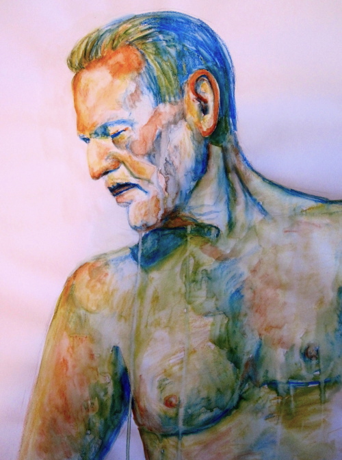
Below is a work by Odd Nerdrum. The Forum Gallery in New York City, is exhibiting 13 of his works through May 5. For a preview of the exhibition, go to the following web site. Although I am often times confused as to what is going on in his paintings, I am so fascinated by the narrative quality of Nerdrum’s work. Drifting reminds me of a dream that I had where I was floating in open water. I have always heard that the origin of your dreams tend to stem from every day life but I’m not sure what “floating in open water” means. Any thoughts?

http://forumgallery.com/exhibition/odd-nerdrum-2/

Drifting

The work below is a self portrait of Odd Nerdrum. He has created many self portraits and often includes himself in his narratives. I think this work is interesting because it has a visceral quality in the textured surface.

Self Portrait

Here is one more by Odd Nerdrum that I think is simply beautiful. It is also going to be at the Forum Gallery through May 5. If you click on the image you can see the lovely subtle pieces of color that he places throughout his work. Especially the red-orange colors in the skin tones. The narrative quality reminds me of a J.W. Waterhouse painting.

The Egg Snatchers

The work below is by Andrew Wyeth. Look at his use of light, and the gorgeous skin tone colors included in the shadows on Siri.I had the pleasure of seeing this painting in person at the High Museum in Atlanta, GA. Wyeth would layer many dots (almost like pointillism but more blended) of color to build up the surface.  “Siri, another Maine model, was painted both alone and with her father George Erickson through the 1970s. The portrait is done in tempera, a medium Wyeth used often. Dry pigment would be mixed with egg yolk then layered on a gessoed board.”

http://www.andrewwyeth.com/images.html#5

Siri

Here is a self portrait by artist, Susan Hauptman. She is also represented by the forum gallery. Hauptman’s self portrait usually stands as the “figure” in her works. The medium used is charcoal and pastel in a photo realistic manner. Her choice of objects to include in the composition is always intriguing, causing the viewer to admire her skill as an artist and also consider the narrative. In this particular work, the title gives us a clue. 😉

Self Portrait as Prima Donna bitch 2000

Finally, I have included a work by Steven Assael. Check out his drawings and paintings by going to the following site. This artist uses (seemingly natural) light to draw attention the passive emotions on the faces of his subjects.

http://www.stevenassael.com/paintings.html

Passengers

A la Georgia O’keefe

This is an image of a mixed media painting that I created in my art journal. I prepared my surface with green acrylic paint long before I knew what I wanted to draw. Doing this ahead of time allowed me to have a fresh green surface to work on, when the need arose. This skull reminded me of a Georgia O’keefe painting and the added flower created a nice contrast.

To prepare my surface, I used an acrylic brush to paint both pages of my (open) journal green. I then scraped a little bit of the paint off to add a few translucent areas and texture to the paper (rather than having a perfectly smooth green surface). I then sketched the skull and flower lightly, in pencil. After roughing in the sketch, I began to add value and tone through layering the crayons. I thought that the pink and red would be a nice contrast to the green background. I even added a little bit of reflected pink/red color into the skull to tie the piece together.

Interior Drawing

This drawing is of the interior of our hallway upstairs and bathroom. I created this work in class with my students to explain sighting and one-point perspective. As part of the assignment, they were also required to incorporate a narrative quality in the work as well. This an 18″ x 24″ graphite on Bristol drawing. The bathroom upstairs was our first big renovation in this house (you can see just how “big” it was by the size of the bathroom).

20 Minute Figure Drawings

Today’s Figure Study

Charcoal, 18″ x 24″ 20 minutes

Conte Crayon on Paper 18″ x 24″

For the drawing above, I toned the paper first before sketching the figure.

Then I took out the lightest values with my kneaded eraser and added darker values where appropriate.

Conte Crayon on Paper 18″ x 24″


Thursday Figure Session

Conte Figure 18" x 24"

I went to the Open Figure Drawing session at the Visual Arts Center in Richmond today. A local artist, David Tanner, started a Thursday group from 1:00 – 3:30 pm.

We began with 10, 1 minute gestural poses then 3, 20 minute poses and one final 30 minute pose. The drawing above was my first 20 minute pose. I liked the curled position although it did not look very comfortable. I began with a gestural line in conte crayon. Once I had correct proportions of the figure, I smudged the conte crayon to achieve mid tones on the figure. I left the white of the paper for areas with strong highlights. Finally I added darker values by layering and smudging the conte crayon.

Pastel Figure - from sketchbook

One of my students brought me a new sketchbook that she picked up from Booksamillion! Apparently they are going out of business and everything is 40% off. Yay! I decided that I would use this one for figure studies. This study is in sepia pastel. It reminds me of Madam X by John Singer Sargent. I think that it is the hand positioned on the table and the pointed nose.

Madam X

The drawing below is the last one that I completed today, in my new sketchbook. I decided to work in graphite for this one.

This was a 30 minute pose so I was able to get a few more details in.

Graphite Figure from Sketchbook

]Open[ Figure Show

Pensive 18" x 24" water soluable crayons on paper
Pensive 18″ x 24″ water soluable crayons on paper

The ]Open[ Figure Drawing Show, featuring artworks created during the open figure drawing sessions at the visual arts center takes place this month from September 2 – 30. The opening reception is today September 9, 2011 at the Visual Arts Center in the Dominion Room on the second floor of the Center. I have three works in the show and it is my first group show in Richmond! I will be teaching and cannot attend the reception however the work will be exhibited for the month of September. If you are in the area, take a look! The Visual Arts Center is located at 1812 West Main Street, Richmond VA 23220 (close to Lombardy on Main).

“Open will offer the public an opportunity to view the diverse, inspiring work created by the participants of VisArt’s Open Figure Drawing. The show will include drawings and paintings that are representative of all levels of skill and experience, from advanced, professional artists, to students, beginners and novices.” – VisArts

All Images © 2013 L.J. Hancock

Hurricane Irene

The wind is getting progressively stronger. Our porch door has blown open twice. I decided to get a quick sketch of the trees outside of my studio window to capture the movement. The lights keep flickering! We will probably lose power any minute now. It just goes to show you how beautiful and dangerous nature can be. If you are a part of this hurricane, be safe!

All Images © 2013 L.J. Hancock

Content

I began this charcoal self portrait with my Drawing 1 students a few weeks ago.  I was teaching them how to begin a self portrait drawing, using the Grid Method. I began working from a photograph and completed the drawing by observation. After all, we are our own 24/7 model! Today I added some more value and contrast, completing the drawing.  I thought that I would share how it turned out.

All Images © 2013 L.J. Hancock

Watermelon Festival

Yesterday, I spent the day at the Watermelon Festival. It was very hot but the watermelon was delicious. The streets were full with all sorts people and pooches. Specifically, two pink poodles. I did not have my art journal with me, so I had to come back and document the puppies from memory. One of the poodles has been dyed since last October. When I first saw the woman walking her dog, I thought that it had to do with her Halloween costume (it was in October). Now that almost a year has passed, I realize that she just likes having a pink poodle. I did a little research online because I was concerned for the animals. Apparently the dye in non-toxic and eventually washes out like shampoo. To each his own I guess. You can see my sketch on my Art Journal page. Cheers!

Embrace Mistakes

This is a page from my last journal. I painted and collaged on the opposite side of the page. I closed my sketchbook after I finished collaging, not thinking that the paint would still be wet. It made a huge red smear on the opposite side. I used my finger to move the paint around and thought that I saw a silhouette of a person sleeping. I used a gesture drawing of my friend asleep on the bus (that I drew two years ago) to fill the space. I think it turned out ok.

One of the key tips in Artist’s Journal Workshop by Cathy Johnson, is to embrace your mistakes. Don’t rip out a page just because you think that you “messed up.” You can use your mistakes to create something new. Or you can look back to see how you have improved over time.

All Images © 2013 L.J. Hancock

Ethereal

One of my favorite works. I start new projects but keep going back to this one. I really enjoyed the process of layering in this piece and hope to do more of these.

All Images © 2013 L.J. Hancock